GSAP Animation Guide
This is a guide for the implementation of the GSAP ScrollTrigger funcitonality on trellix.com
GSAP ScrollTrigger Documentation
Animation examples are provided. Most aniomations will only occur once while scrolling. Use the button below to reset ScrollTrigger animations.
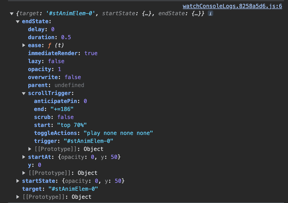
All properties for the ScrollTrigger elements are logged in the Dev Tools console of your browser.
Default Animations
The class .st-anim is the activation class and must be assigned to any element that you wish to have any ScrollTrigger animation.
The default animation is a subtle fade-up (opacity goes from 0 to 1 and y-position goes from 50px to 0px)
This is automatically applied to any element which has the class .st-anim. It can be overridden if any style ScrollTrigger classes are assigned to the same element (go to style classes explanation).
The default target element is the element itself, i.e. the animation will trigger when the start marker hits the start trigger marker (go to timing explanation | go to markers explanation)
.st-anim
Animation: Fade Up
Trigger: Self
Start: Element Top @ 70% From top of Viewport
End: N/A
Markers: None

Markers
Applying the class .st-markers to a ScrollTrigger element will show the relevent default markers for that element (read more)
Use these markers to visualize the trigger points of the element. This will allow you to more easily tweak the positioning and timing of the animations. These markers are for testing purposes and will not show on the live version of a page.
There are 2 sets of markers: The element markers and the page markers. Each contain a start marker and an end marker. By default, the start markers are green, and end markers are red in each set (go to distinguishing markers explanation).
As the page is scrolled, the element markers scroll along with their respective element, indicating where that element's animations will begin and end. When the element start marker hits the page start marker, the element's animation will begin. The end markers are only used for scrubbing animations (go to scrubbing explanation).
By default, the element start marker is at the element's top, and the element end marker is at 2/3 the element's height. By default, the page start marker and page end marker are positioned at 70% from the top of the viewport.
.st-anim.st-markers
Animation: Fade Up
Trigger: Self
Start: Element Top @ 70% From top of Viewport
End: N/A
Markers: Default
Timing: Default
Distinguishing Markers
With multiple elements on the page, it may be necessary to have several elements trigger at the same time. Especially if the elements are invisible before the animation (which they are by default), it may be difficult to tell the difference between the markers for different elements.
You can use these marker classes to help position & color the markers (you must still apply the .st-markers class for these to show):
.st-marker-start-[color]
.st-marker-end-[color]
.st-marker-indent-[pixels]
.st-anim.st-markers.st-marker-start-blue.st-marker-end-purple.st-marker-indent-150
Animation: Fade Up
Trigger: Self
Start: Element Top @ 70% From top of Viewport
End: N/A
Markers: Start = Blue | End = Purple | Indent = 150px
Timing: Default
.st-anim.st-markers
Animation: Fade Up
Trigger: Self
Start: Element Top @ 70% From top of Viewport
End: N/A
Markers: Default
Timing: Default
Animation Style Classes
ScrollTrigger is able to animate basically any css property. For this early version of the Trellix implementation, there are only a few which classes assigned to them. More will be added as needed as we use this functionality for the website.
You are able to apply multiple style classes to mix-and-match different animation properties. For example: applying .st-slide-right and .st-fade will cause the element to fade in from left to right (ending in its intrinsic position) when the animation is triggered.
The current list of style classes are:
.st-slide-right.st-slide-left.st-slide-up.st-slide-down.st-rotate-cw.st-rotate-ccw.st-scale.st-fade
Sliding
Rotate & scale
.st-anim.st-rotate-cw
Animation: Rotate Clockwise
Trigger: Self
Start: Element Top @ 70% From top of Viewport
End: N/A
Markers: None
Timing: Default
.st-anim.st-rotate-ccw
Animation: Rotate Counter-Clockwise
Trigger: Self
Start: Element Top @ 70% From top of Viewport
End: N/A
Markers: None
Timing: Default
.st-anim.st-scale
Animation: Scale Down
Trigger: Self
Start: Element Top @ 70% From top of Viewport
End: N/A
Markers: None
Timing: Default
.st-anim.st-fade
Animation: Fade In
Trigger: Self
Start: Element Top @ 70% From top of Viewport
End: N/A
Markers: None
Timing: Default
Animation Values
Except for .st-fade, you can provide a value to change the amount of the element's properties by appending the classes with -[value].
For example: .st-scale-50 will animate the element by starting the element scaled to 50% of it's intrisic scale, .st-slide-right-100 will animate the element from 100 pixels left to 0px right of its intrinsic position.
The default values are for each are:
Slide: 50px
Rotate: 90°
Scale: 120%
Combining Animations
You can apply multiple style classes to a single element to mix-and-match animations to all trigger at once.
For example, if you want to change the default animation from Fade Up to Fade Right, you need to apply both .st-fade and .st-slide-right.
.st-anim.st-fade.st-scale-50.st-rotate-ccw-45
Animation: Fade + Grow + Rotate CCW 45°
Trigger: Self
Start: Element Top @ 70% From top of Viewport
End: N/A
Markers: None
Timing: Default
Timing Classes
Element animations can be adjusted by applying classes that change trigger positions, animation delay, and animation timing.
Element Triggers
As discussed above in the markers explanation, elements have 2 different triggers, a start trigger and an end trigger. The end trigger is only used with scrubbing, and indicates when the animation ends (go to scrubbing explanation).
The default element start trigger position is set to the top of the element. The default position of the page start trigger (indicated by the page start marker) is set at 70% from the top of the viewport. That means that, by default, the element animations will be triggered when the top of the element reaches 70% from the top of the viewport.
These can be changed by applying trigger position classes to the element. The start trigger class is formatted as .st-start-[value], and adjusts the page start trigger position only for that element. When the top of the element reaches the adjusted page start trigger, it will trigger there instead of the default position. The page end trigger uses the format .st-end-[value]. The value unit is always %, meaning that the value provided will always be a percentage of the viewport height from the top of the viewport.
For example, if applying the class .st-start-50, the element with this class will have a page tart trigger at 50% from the top of the viewport, and the marker will show as such if markers are turned on for that element (marker classes are added for clarity).
.st-anim.st-start-60.st-markers.st-marker-start-yellow.st-indent-150
Animation: Fade Up (Default)
Trigger: Self
Start: Element Top @ 60% From top of Viewport
End: N/A
Markers: Start = Yellow | Indent = 150px
Timing: Default
.st-anim.st-start-50.st-markers.st-marker-start-orange
Animation: Fade Up (Default)
Trigger: Self
Start: Element Top @ 50% From top of Viewport
End: N/A
Markers: Start = Orange
Timing: Default
Animation Duration
The amount of time an element takes to animate can be adjusted by adding the duration class to the element. It is formatted as .st-duration-[value]. The value is given as milliseconds (1000 milliseconds = 1 second).
For example, if the class .st-duration-2000 is added to an element, the animation will take 2 seconds to complete once triggered.
.st-anim.st-duration-3000
Animation: Fade Up (Default)
Trigger: Self
Start: Element Top @ 70% From top of Viewport
End: N/A
Markers: None
Timing: Duration = 3 seconds
Reverse Animation
You can apply st-reverse to allow the element to animate backwards (essentially undoing the animation) when the page is scrolled back up.
.st-anim.st-reverse
Animation: Fade Up (Default)
Trigger: Self
Start: Element Top @ 70% From top of Viewport
End: N/A
Markers: None
Timing: Reverse on Backward Scroll
WIP
Target Classes
Target classes allow element to be triggered by other elements on the page. By default, the target element is the element itself.
Scrubbing Animation
Elements can be set to scrub through their animation as the page is scrolled. This means that the animation won't trigger as soon as the element start trigger reaches the page start trigger. Instead, ScrollTrigger tweens the animation from the element start trigger position to the element end trigger (as they move between the page start trigger and the page end trigger). When the element start trigger is at the page start trigger, the animation is at the beginning. When the element end trigger is at the page end trigger (which is at the same position as the page start trigger, by default), the animation is at the end.